
Despite my good intentions, I have neglected my blogging for the past several months! So, I’m diving back in with another look at visualizations that interest me (and that seem useful for learning).
Recap: Intriguing structures 1 was about interactive online calendars that could be used to catch a learner’s attention and encourage them to explore a particular topic in-depth (self-directed learning).
I’m also interested in the diversity of approaches to representing events or processes or tasks, over time as graphic timelines. These timelines are graphic presentations of events or data that may include visual elements and symbols, images, text, or other media, usually along a line, but also along curves or circles. Timelines can help us understand historical events, identify relationships, recognize trends or detect subtle changes over time.
Physical visualizations
I’ve used physical iterations of timelines (sheets of coloured paper that group participants write and/or draw on) while working with groups of adult learners. The individual or small group research time was spent collecting information and illustrations of events that occurred within a period of time. Each person created an information post (a sheet of paper, coloured or shaped as a puzzle piece) and then worked with others to arrange them along a timeline on a wall or a series of flipcharts. The actual placement of info-sheets encouraged the participants to engage in deeper discussion of interesting or confusing timeline events and resulted in a physical outcome they could all enjoy and a deeper understanding of the time period.
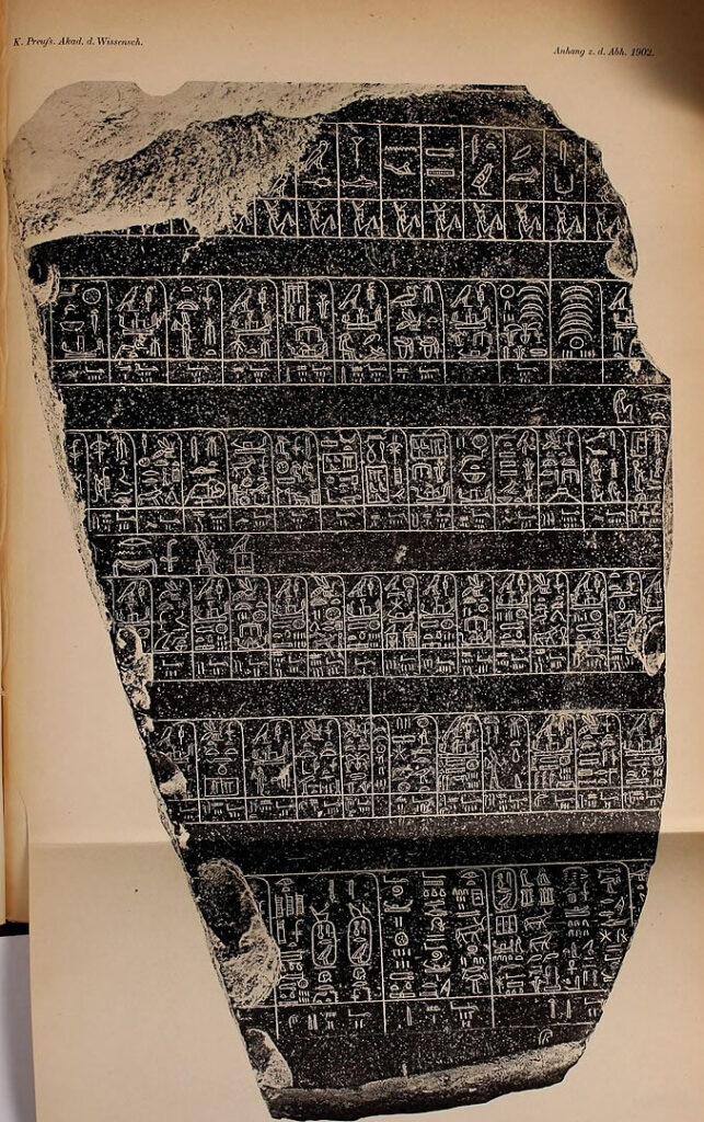
Some physical graphic timelines are inscribed in stone (on tablets or stele) or displayed as images painted or photographed and arranged on walls or billboards.
One of the earliest known timelines was found on a fragment of a stone tablet or stela known as the Palermo Stone. The fragment is one of only seven fragments that remain of a list of Egyptian kings from 3150-2890 BCE carved on a large stele known as the Royal Annals of the Old Kingdom of Ancient Egypt.
As paper-making and printing technologies evolved, timelines could be printed, displayed and shared more easily. But the widespread use of timelines was still limited.
Digital interactive timelines
Well-designed timelines encourage learners to interact with historical or other kinds of information. Digital interactive timelines can provide opportunities to dig into a particular period or event, view it in different ways, compare it with other timelines, or personalize the content or display.
The benefit of interactive online timelines is the ability to update information or change viewpoints to gain a varied, often broader and deeper understanding of historic or current events or to plan activites that interact within a complex group project.
Examples to explore
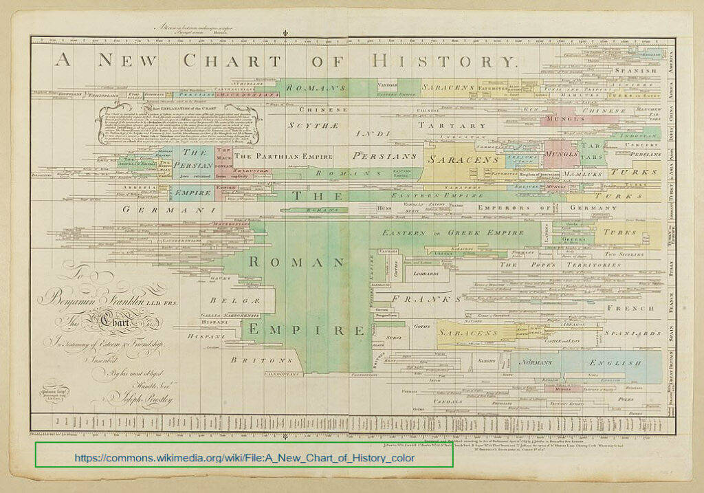
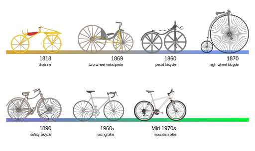
Top row: (1) J. Priestley’s “A New Chart of History”, 1769. (2) Bicycle evolution. Go to: https://commons.wikimedia.org/, search by title.
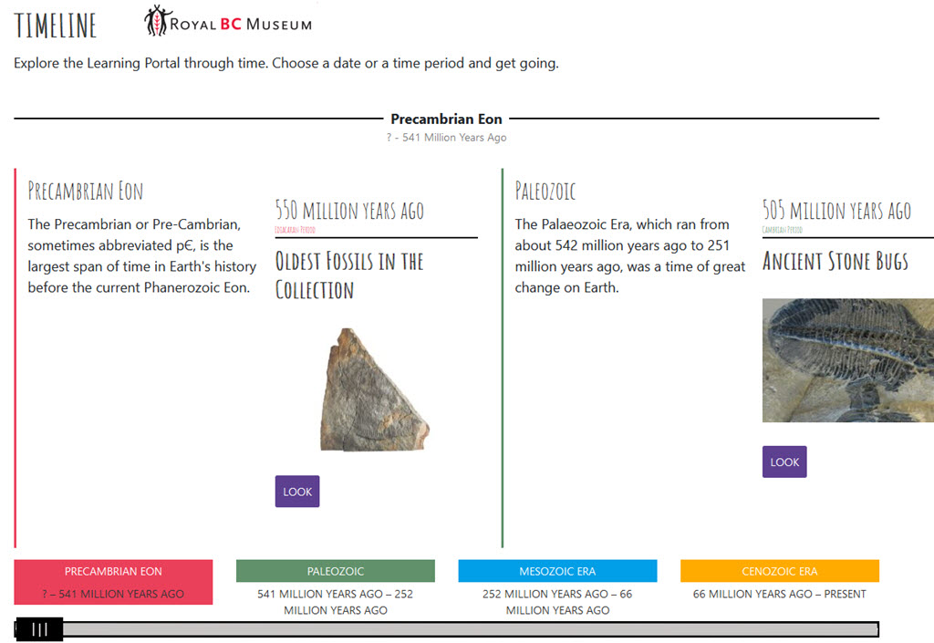
(3) Royal BC Museum’s Learning Portal Timeline, https://learning.royalbcmuseum.bc.ca/geo-timeline/
Bottom row:
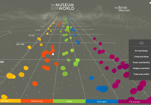
(1) The Museum of the World, Google, The British Museum. https://experiments.withgoogle.com/the-museum-of-the-world
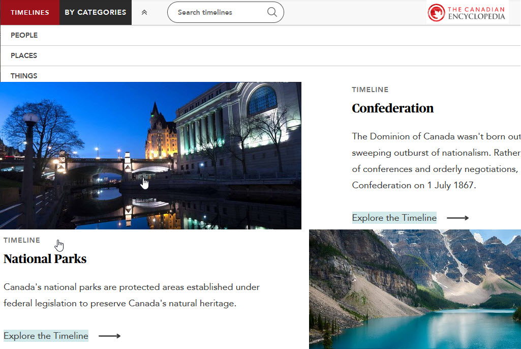
(2) The Canadian Encyclopedia, Timelines https://www.thecanadianencyclopedia.ca/en
Tools to try
If you’d like to try creating an interactive timeline for yourself, here are a few suggestions:
H5P: create HTML5 based interactive timelines. You’ll need to use the H5P plugin in your Wordpess site or in LMS systems like Canvas, Brightspace, Blackboard or Moodle.
Canva: an account is required, some restrictions on sharing, size, complexity, free templates available
Timeline JS: a free open-source tool that uses Google spreadsheets – some limitations on complexity and size – lots of tutorials available
Visme: a limited selection of free templates but all the tools to create your own from scratch – easy to use – some limitations on free accounts