I’ve had fun the last week or so, visiting many interesting, intriguing web places using the beautiful ‘Festive Calendars’ created by Oxford Continuing Education from 2023 to 2017. Each year’s calendar begins and ends with the following explanation:
“Our gift to you: each day during the month of December, explore free, educational online resources – as recommended by staff at Oxford Continuing Education. Thirty-one days of free learning, to take you right up to the new year! Simply click the numbered doors for each day. Please forward this page to friends, using the share buttons provided below.”
“The resources here are provided for informational purposes. If you have questions about the content linked to above, please contact the keepers of these external websites.”
https://www.conted.ox.ac.uk/festive/
Six years of 31 days of weblinks to ‘learn more’ was a bit overwhelming so I’ll only share some of my thoughts and reactions to what I experienced and a few gems I plan to explore in the future.
Some general thoughts about the format of each visual calendar:
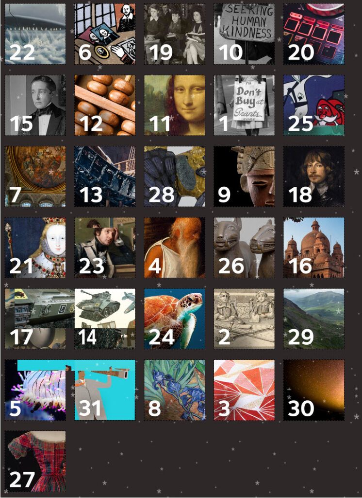
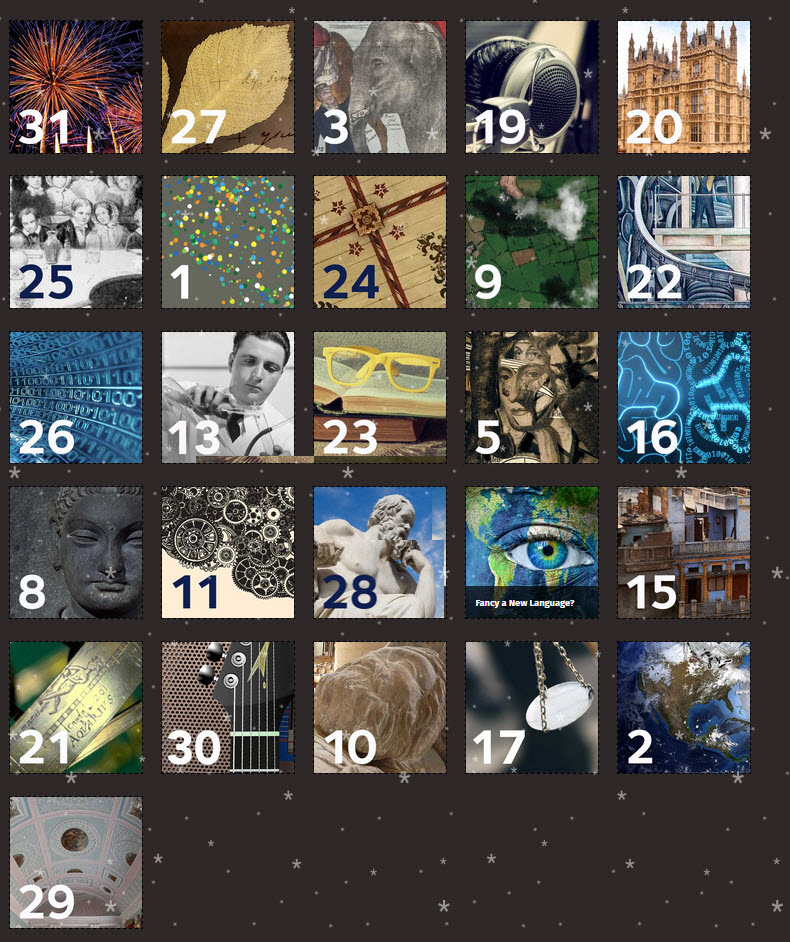
- active elements like the variable fall of snowflakes across the face of the calendar block images and the ‘open the door’ interaction when you click on each numbered block, inspired curiosity and invited participation (as you are drawn to continue clicking through to see what was ‘behind each door’)
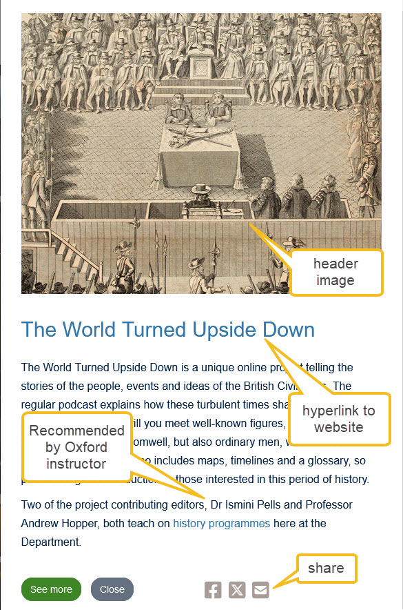
- each block image contained part of a larger image found on the home page of each weblink – the partial image and the often vivid colours or odd shapes attracted attention and invited further exploration
- clicking on the date block ‘opened the door’ to the information page, providing a brief explanation of the site and, at times, the name and subject specialty of the Oxford professor that had suggested the resource. A piece of the date block’s image was retained with the date reversed on the ‘opened door’ while the text and images/links drew the viewer into a guided exploration of the section of a site that might be relevant or interesting
- in many cases, the information page included the names and subject specialities of the professors who recommended the resource – adds more ‘weight’ to the web resource if the viewer was a student or curious about a particular Oxford subject course option?
Distractions (annoying or encouraging persistence?)
- at times the active elements of the calendar (intermittent snowflakes falling down and diagonally across the face of the calendar AND the seemingly random movement of date blocks to other parts of the array) were distracting but made the viewer (me at least) concentrate harder to select the next item to explore
- each information box had the same layout design but only a couple of the green ‘See more’ buttons actually linked to a different resource. Most simply took you to the same site as the subject title of the information box.
- Each information box also contains links to encourage the viewer to share the resource widely – Facebook, X (formerly Twitter) and standard email. Would possibly increase value of the calendar as a means to engage a wider audience and provide ‘payback’ to the viewer as a means to engage social media audiences?
- weblinks were occasionally unaccessible or just meant specifically for a British citizen or someone studying a particular subject at the university (not surprising of course)